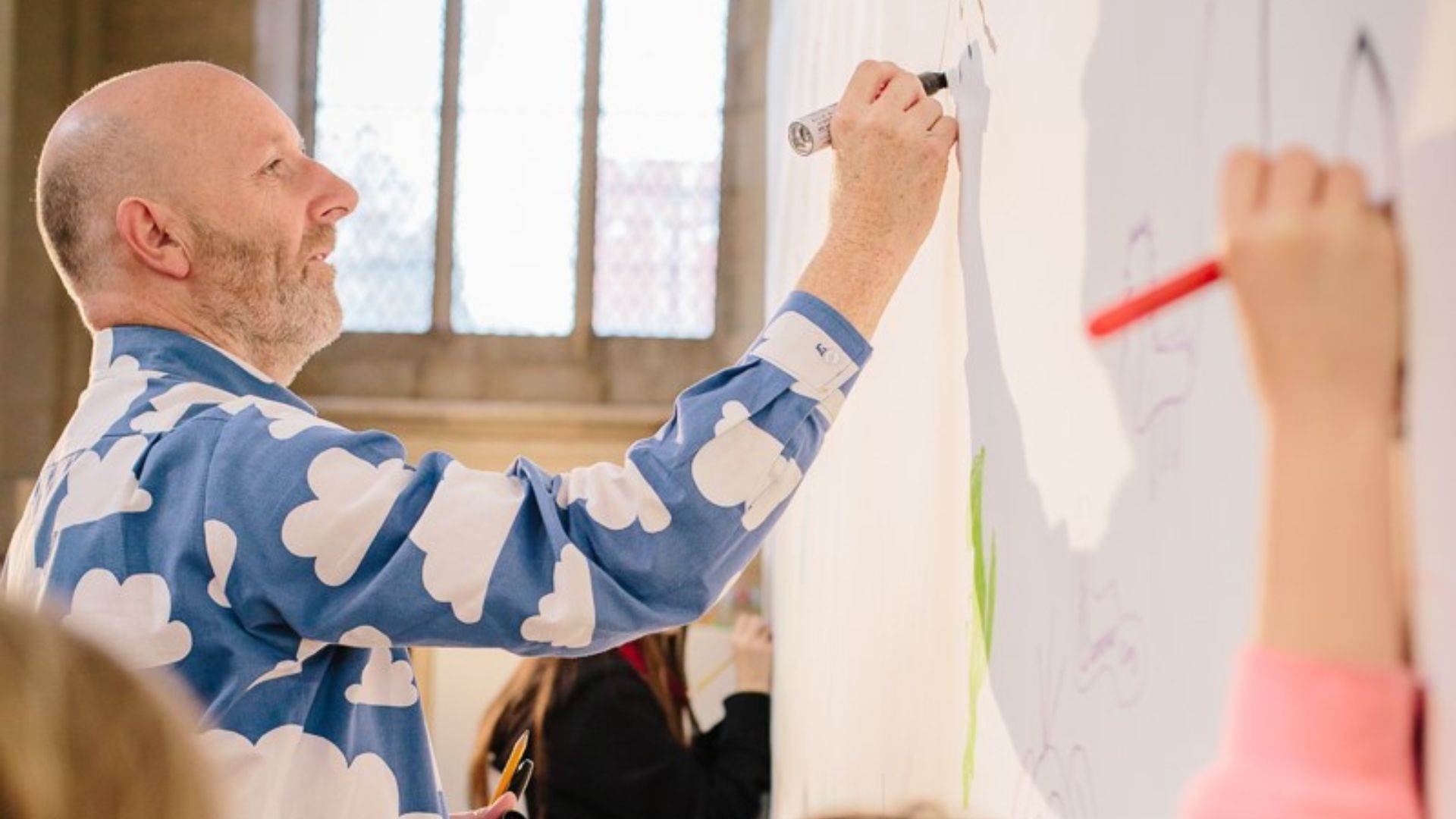
The Power of Pictures: the illustrations that inspired our new Writer in Residence Nick Sharratt
Published on: 26 September 2022 Author: Nick Sharratt
Welcome to the first of my Writer in Residence blogs. I thought we’d start by looking at some of the book illustrations I remember most vividly from my own childhood.
Credit: James Mulkeen
I don’t need to open up the actual books to see these images as clearly as anything in my head. They’re etched on my brain, so they obviously made an enormous impact. I’m sure there will be pictures in the first books you encountered that had a similar effect on you too – and it’s going to be the same for today’s young readers. That’s the power of pictures!
I am a Bunny
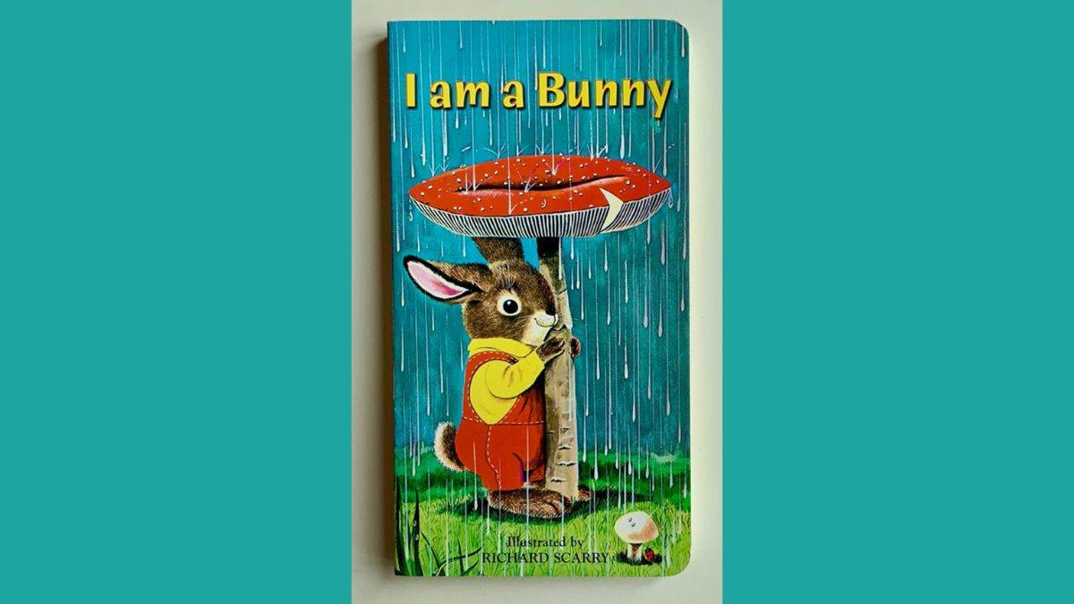
I am a Bunny, Text: Ole Risom, Illustrations: Richard Scarry, Publisher: Golden Books
I don’t recall having many books when I was a tiny tot, but I most definitely do remember I am a Bunny. Little children are able to engage with visual imagery in a very intense way if they can connect with it, and it’s easy for me to see why this book (illustrated by the amazing Richard Scarry) would have made such an impression on the two-year-old Nick. It’s full of pictures that really appeal to the senses. Take the cover, with its downpour of cold, wet raindrops (you can hear their plip-plops) and the sodden squelchy grass, contrasting nicely with the soft, warm, strokable fur of the sheltering bunny, nice and dry in his freshly laundered clothes (and looking rather pleased with himself into the bargain). I reckon my heightened responses as a little boy to such tactile-seeming imagery would have made looking at this picture a pretty thrilling experience.
The General
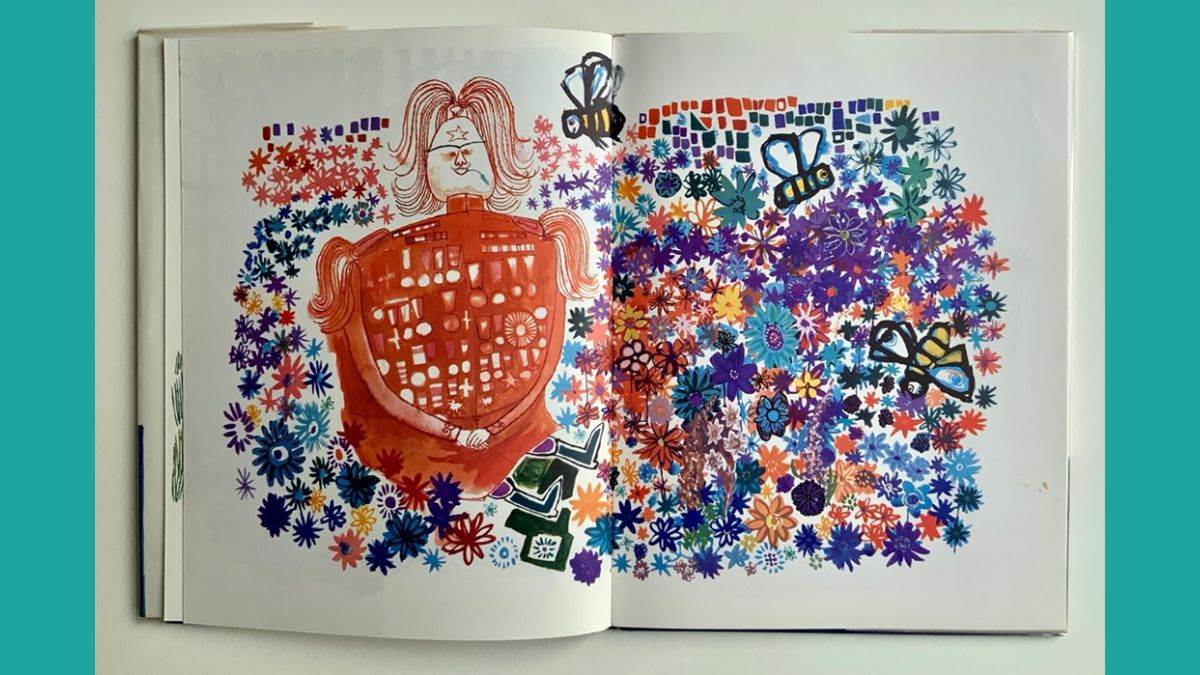
The General, Text: Janet Charters, Illustrations: Michael Foreman, Publisher: E.P. Dutton and Co
This stunner of an image is from a book called The General, with gorgeous artwork by Michael Foreman. I had this book as a pre-schooler. This picture was my favourite. That enormous sea of brightly coloured flowers thrilled and dazzled my little brain. (The bees were a bit on the large size but their friendly faces more or less reassured me they weren’t going to sting.) The actual written story is quite wordy, but I absolutely got the message, via the illustrations, that sitting in a field of flowers chewing on a bit of grass is a much, much better thing than marching, guns and fighting.
Ladybird Books
If you were at primary school in the late ’60s and early ’70s, the chances are that you read Ladybird books, and maybe you have similar nostalgic feelings about them. I’m not talking about the Reading Scheme books with the offputtingly perfect Peter and Jane, but rather the ‘Well Loved Tales’ and books from the numerous factual series on nature, history, jobs and so on. I’m one of four and between us we had quite a collection of the sturdy little books. We were all hooked on them. Why? Because of the pictures. I’ve chatted with so many people about Ladybirds and we all feel the same. Those pictures! They had this strange magical power that made them utterly real in our young minds, so that we could step right into the scene if we wished and lose ourselves in whatever was going on there.
They were great pictures: entertaining, informative and atmospheric, and always filling up the right-hand pages, so you could really focus on them. They were painted in a realistic style, carefully composed and easy to decipher even when crammed with detail. Given a young child’s powerful response to that kind of imagery, enjoying a Ladybird book could be a heady experience if the subject struck a chord. It's impossible for me to choose just one picture, so here are four from the scores that stay with me to this day.
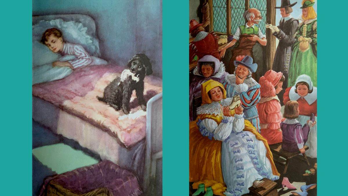
Mick the Disobedient Puppy, Text: Noel Barr, Illustrations: P.B. Hickling, Publisher: Ladybird, The Elves and the Shoemaker, Text: Vera Southgate, Illustrations: Robert Lumley, Publisher: Ladybird
I found the above picture from Mick the Disobedient Puppy intensely thrilling and shocking at the same time, because my gran and grandad had a slippery smooth and cool-to-the-touch pink satin eiderdown just like that on their bed. And I was always impressed by the fabulous clothes of the well-to-do characters in the ‘Well Loved Tales’ series. In The Elves and the Shoemaker the exquisiteness of the footwear made by those clever elves had me open-mouthed.
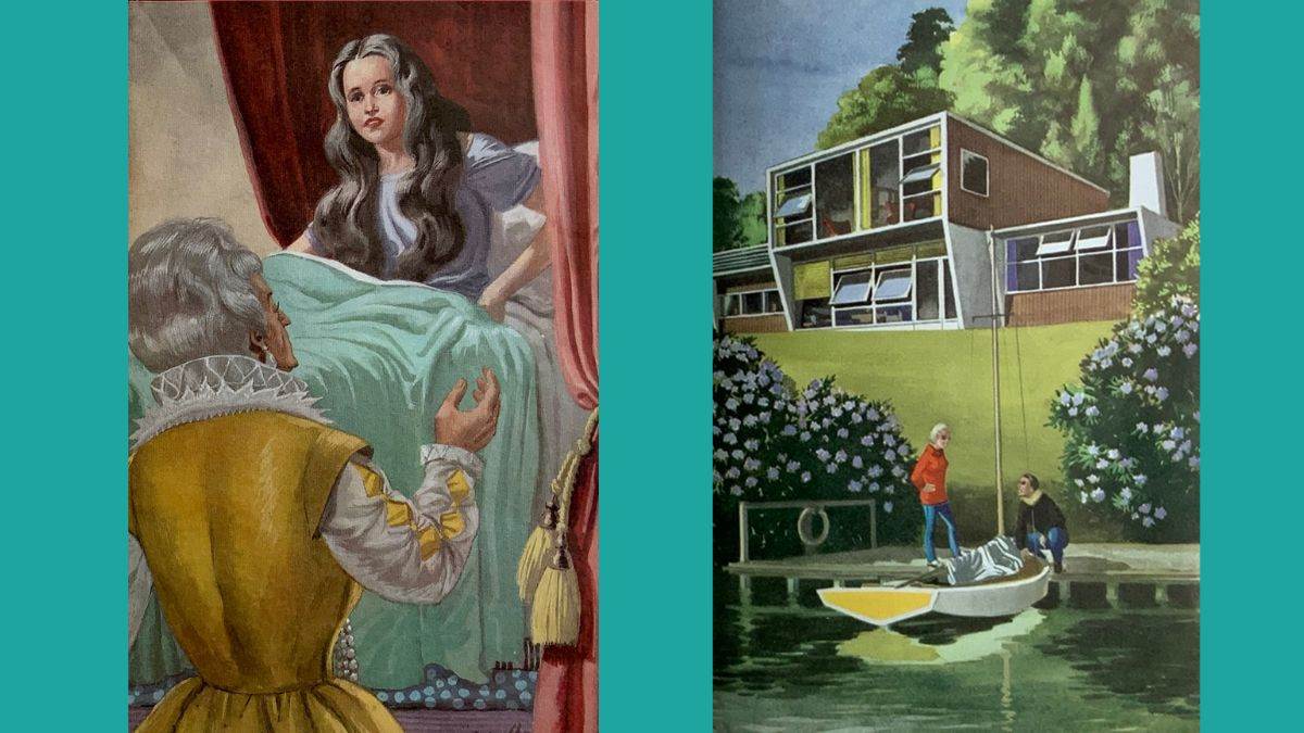
The Princess and the Pea, Text: Vera Southgate, Illustrations: Eric Winter, Publisher: Ladybird, The Story of Homes and Houses, Text: Richard Bowood, Illustrations: Robert Ayton, Publisher: Ladybird
There was a danger of sensory overload in The Princess and the Pea, what with the torrential storm, the massive pile of soft mattresses and the rock-hard little pea. With my jaded adult eyes, it now seems to me that the artist has gone overboard with the highlights in the princess's hair, but my more enjoyable reading as a child was that she'd gone temporarily grey after her sleepless night. I REALLY wanted to live in the above house in The Story of Houses and Homes and I still do.
The Story of Man
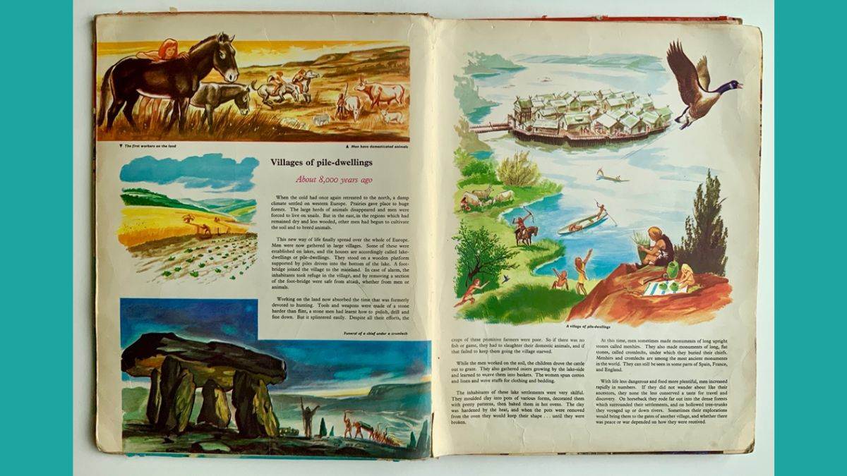
The Story of Man, Author: Michel Lacre, Illustrations: Pierre Leroy, Publisher: Paul Hamlyn
My brother and I were both similarly hypnotised by the pictures in The Story of Man, a large format, encyclopaedic book that seemed positively gigantic to us. We individually pored over the images, more loosely painted than the Ladybird pictures, but just as spine-tinglingly alive in our heads, especially the ones where the artist’s unusual choice of colours created an otherworldly, quite creepy atmosphere. There seemed to be an awful lot of menacing skies, torrential rain and thick mud in the past, to go with the heavy toil, violence and general discomfort. It was utterly gripping to travel there by way of the pictures, but a bit of a relief to get back to the 1970s when you finally put the book down.
James and the Giant Peach
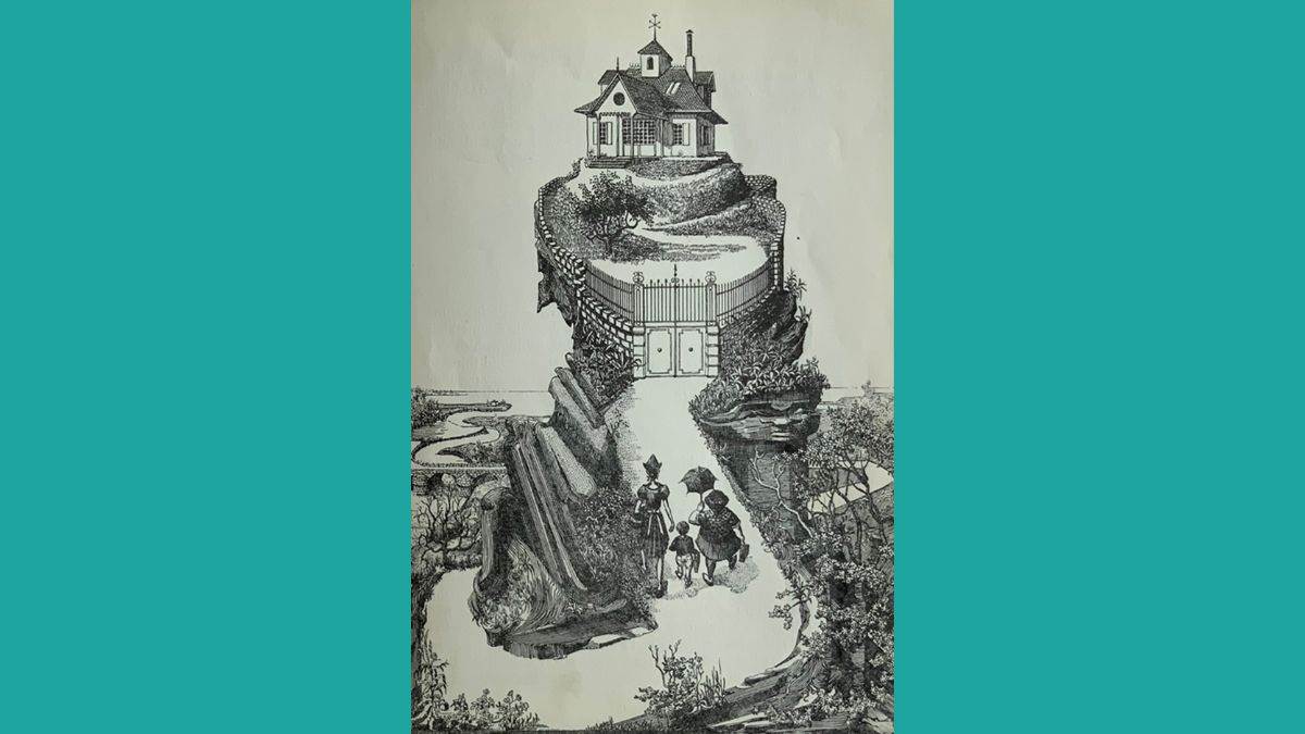
James and the Giant Peach, Author: Roald Dahl, Illustrations: Michel Simeon, Publisher: George Allen and Unwin
I had two Roald Dahl books as a boy: Charlie and the Chocolate Factory and James and the Giant Peach. They are the first chapter books I remember reading all by myself. Of course, the storytelling was sensational, but the illustrations were hugely important too. This was before the legendary Roald Dahl/Quentin Blake partnership. My two books were illustrated by other artists, whose black-and-white images tempted me in and helped me to tackle all those sentences as well as cementing how I would forever see the characters in my head, just as Blake’s brilliant pictures have done for more recent generations.
While Blake deftly brings out the humour in the stories, Michel Simeon's artwork adds an extra touch of gothic. I was riveted by them and particularly liked this scene-setting picture. There’s such a lot to take in – the odd, old-fashioned house, perched vertiginously on the rocky hill… the chalky lane that winds all the way back to the sea … poor little James trapped between his two odd-looking aunts and literally walking into what you just know is going to be an amazing (and maybe a bit scary) adventure. Everything is drawn in a crisp, clear way that I found incredibly appealing. I loved how I could see every brick in the garden wall, every tile on the roof, every blade of grass on the somewhat scrubby lawn. I also really enjoyed how the artist had used neat lines and dots to give the rocks and trees shading and texture. I sensed and liked that great care had been taken to create this picture for me to feast my eyes on. There was the extra treat too, of spotting for myself the faces of Aunts Sponge and Spiker in the hillside terrain – it felt like the artist and I were sharing a wonderful secret together. Being a child who was obsessed by drawing, this illustration surely would have inspired me, on some subliminal level, to try and put some of those qualities into my own pictures if I could.
The Dribblesome Teapots and other Incredible Stories
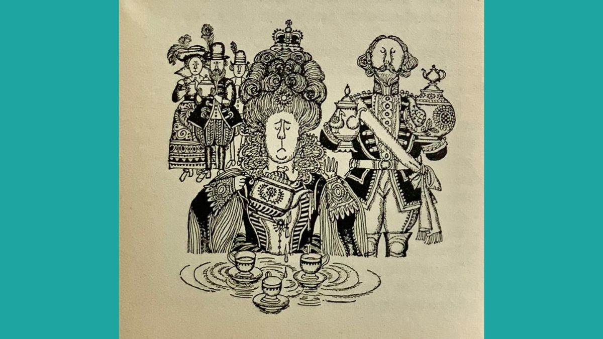
The Dribblesome Teapots and other Incredible Stories, Text: Norman Hunter, Illustrations: Fritz Wegner, Publisher: Puffin
I know for certain that the pictures in The Dribblesome Teapots inspired me. I found myself drawing loads of black felt-tip pen pictures of kings and queens after reading this book. Fritz Wegner’s masterful use of black and white made his pictures tremendously satisfying to look at. As well as enjoying all the perfectly drawn details like the hair and the patterns on the costumes, I loved the charm and gentle humour the pictures exuded. They made me feel happy. Don’t you think that’s an incredible thing for marks on a piece of paper to be able to do?
First Slice Your Cookbook
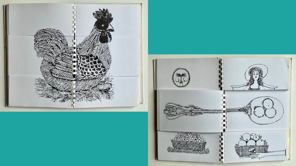
First Slice Your Cookbook, Author: Arabella Boxer, Illustrations: Alan Cracknell, Publisher: Nelson
When I was quite little, I liked to look at the pictures in my mum’s cookery books. What I was seeking were the biscuits and cakes and the party food. Then I’d imagine tucking in, or plan what I’d like to be eating at my next birthday party.
Food is a brilliant subject for children – it’s something they have very definite feelings about. We can all remember foods that we absolutely adored as children, and, equally, foods we loathed with a fierce passion – in my case lemon meringue pie and broad beans. It’s no wonder that so many great children’s books revolve around food.
Anyway, one of my mum’s recipe books was quite different. It was called First Slice Your Cookbook and it was literally sliced in three, so that you could flip the pages and create your own menu from one of the starters, mains and desserts. What I loved about the book was that buried among the pages were a dozen or so illustrations that would magically appear when the pages were in the right order. They were delightful illustrations too, in my favourite kind of black-and-white style. But it tickled me just as much to put them together in the wrong order and create my very own surreal works of art.
It was the first flap book I’d ever encountered and I thought it was just brilliant. I’ve created several flap books of my own in my career and they’re all because of the amusement I got out of that cookery book when I was five or six.
My Learn to Cook Book
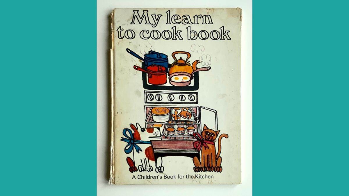
My Learn to Cook Book, Text: Ursula Sedgwick, Illustrations: Martin Mayhew, Publisher: Paul Hamlyn
The My Learn to Cook Book was a firm favourite with me too, not for the recipes, but because of the exuberant, cartoony artwork that just said ‘fun!’. The carefree style and the bright colours standing out against the white had such a cheerful effect. I could tell that the artist had used something similar to my own beloved felt-tip pens, and their way of drawing wasn’t that different to my own, which made the pictures seem even more friendly and the book itself completely unintimidating.
When a book had realistic pictures, I was too absorbed in the imagery to think about how they might have been created, but from about the age of seven, in the case of more stylised illustrations, as well as enjoying the story they were telling, I liked to ponder how they were done, and why the artist had made certain marks or used this or that medium. I then wanted, more and more, to try the same things out for myself.
Two Can Toucan
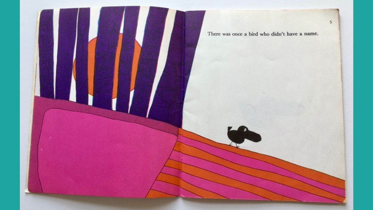
Two Can Toucan, Text and illustrations by David McKee, Publisher: Puffin
We had a copy of David McKee’s Two Can Toucan in our house and I couldn’t help but be drawn to the fantastically bright colours he used and the feel-good vibe they gave off. I was also tickled by the outrageousness of red grass, blue elephants and purple tree trunks (though I wasn’t prepared to be so rule-breaking with my own colouring-in). I’m sure there’s plenty of research into why children are attracted to bright colours – I certainly was. Perhaps I’ve never properly grown up, but I still get more fulfilment from bold shades than I do from tasteful, subtle tones. I blame this book for my all-time favourite, eye-popping colour combination: bright orange and hot pink.
Pop-Out The Owl and the Pussycat
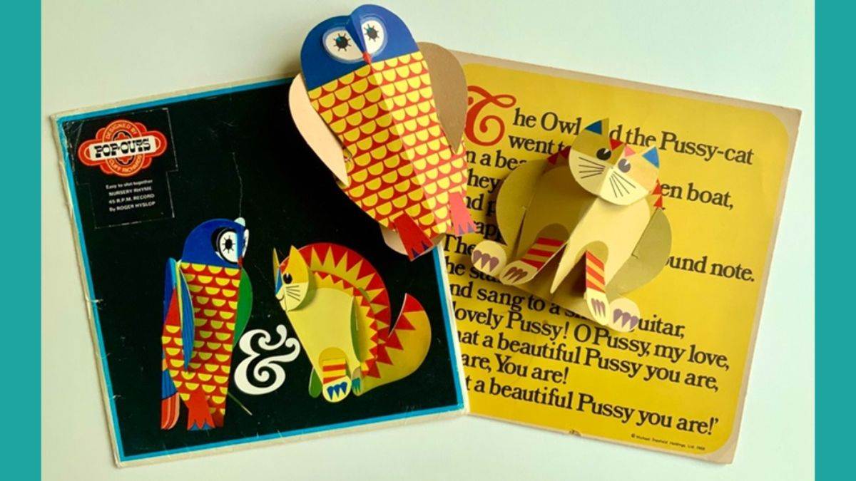
Pop-Out The Owl and the Pussycat, Publisher: Michael Stanfield Products
This The Owl and the Pussycat Pop-Out gave me a lot of delight too. It came with a flexi-disc record of the nursery rhyme, plus there was the added thrill of the flat shapes turning into something 3D when you folded and slotted them together. Incidentally, I remember the exact date I was given my Pop-Out: it was the same day in April 1969 that my youngest sister was born. It was meant to distract me – which it did!
The Giant Jam Sandwich
The Giant Jam Sandwich, Story and Illustrations: John Vernon Lord, Verses: Janet Burroway, Publisher: Picture Piper
I can also remember exactly where and when I first encountered The Giant Jam Sandwich. It was in a holiday cottage in Yorkshire and I was about to have my eleventh birthday. I was reading children’s novels and the odd Agatha Christie by then, but still enjoyed looking at picture books should they come my way. (Picture books are for all ages and it’s wrong and sad that they’re so often abandoned as soon as one can read longer books.) I thought it was sensational: a brilliantly silly story (food-related, note) and John Vernon Lord’s pictures that were just the best – fabulously quirky, wonderfully drawn and coloured and filled with loads of delightful details. I already knew then that art was my thing, but this book, more than any other, made me think about how incredible it would be to be an illustrator one day.
So, these are some pictures that really resonated with me as I was growing up. The memory of them is precious to me for numerous reasons. Were there pictures in the books you looked at that have the same kind of power for you? I bet there were. And isn’t it important that ALL children have the opportunity to develop their own picture-linked memories like ours?
Topics: Picture book, Writer in Residence, Features
