A Trip to the Library: Pictures that Pop!
Published on: 07 October 2022
Our new Writer and Illustrator in Residence Nick Sharratt shares a few amazing picture books he found in his local library...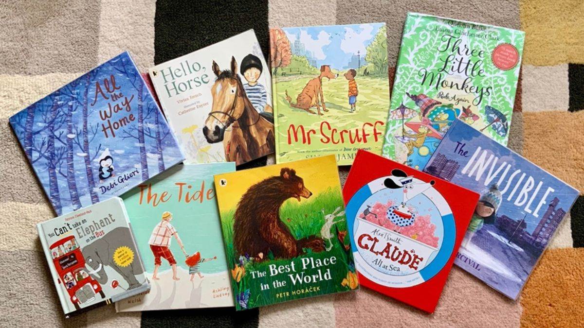
As it’s Libraries Week and a celebration of all that’s wonderful about these vital places, I thought it would be fitting to go down to my local library, borrow some picture books and use them to look at a few of the things writers and illustrators do to help make reading picture books such a rewarding and enjoyable experience. Have you joined your library, by the way? At mine you can borrow up to forty books at a time, but I limited myself to nine – it was all I could fit in my bag!
I wasn’t looking for any particular themes and I chose my books pretty much at random, but one thing they shared in common was that they all had covers that made me want to pick them up, thinking they’d be interesting to read. You can usually get a very good impression of what a picture book will be like from how it looks on the outside. I’m very tempted to say, ‘Always judge a picture book by its cover!’
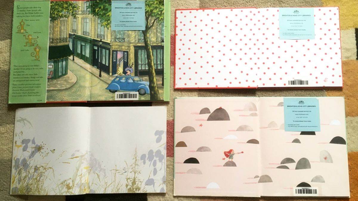
Opening up a book to take a quick look inside, the endpapers are probably the first thing you’ll see, especially if it’s a hardback book. They can be left plain, but personally, I always take it as a good sign if some sort of decorative treatment has been given to these occasionally overlooked pages at the front and back of the book.
I’m really focussing on the visual side of these books rather than the words, but I think it’s important to say that writing a picture book is a specific art, and not all writers can do it. The author has to be able to share the storytelling with the illustrator and give them the freedom to get across lots of information about the story in their artwork. So picture book texts are generally quite short, allowing the reader absorb all kinds of things from the images. (I’ve just realised that with five of the books I chose, the author and the illustrator are the same person.)
The nine illustrators of these books have their own unique drawing styles and their individual methods of creating illustrations. Six have drawn with a black line and added colour.
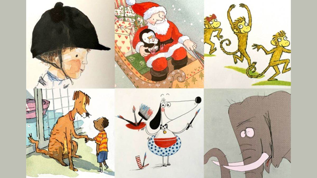
Three haven’t used black lines at all.
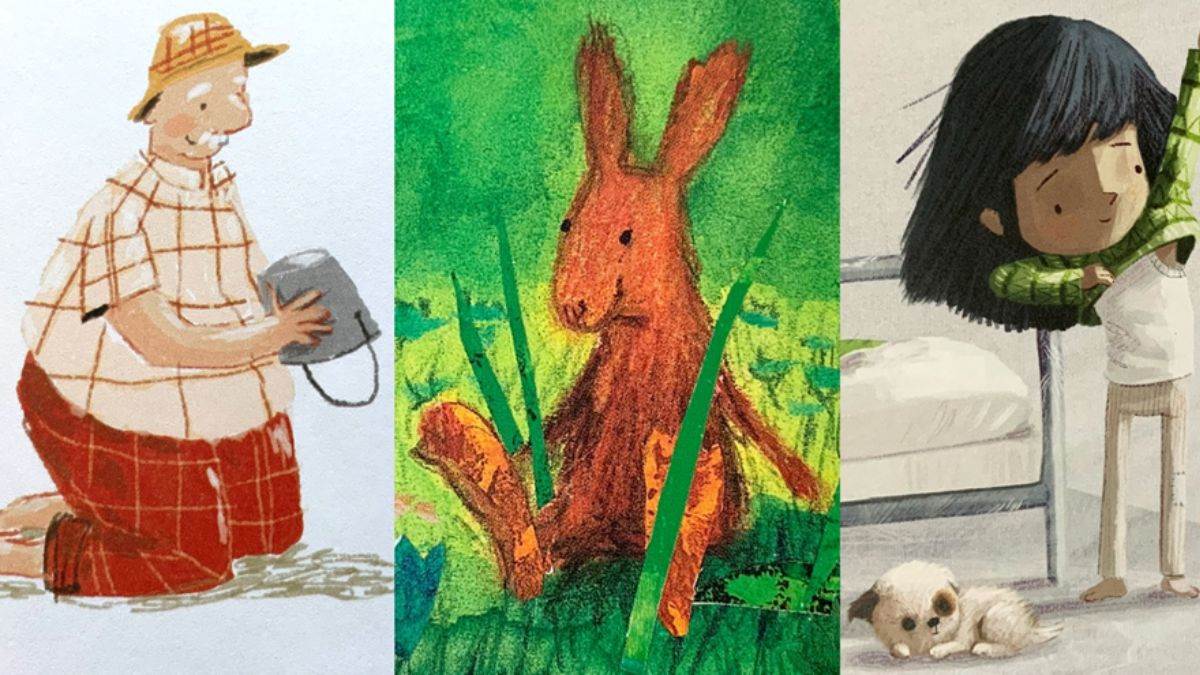
But however they’ve gone about making their images, each artist’s linework has a different quality, giving their book its own distinctive feeling.
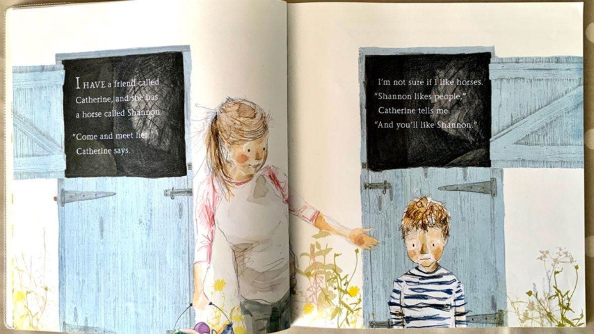
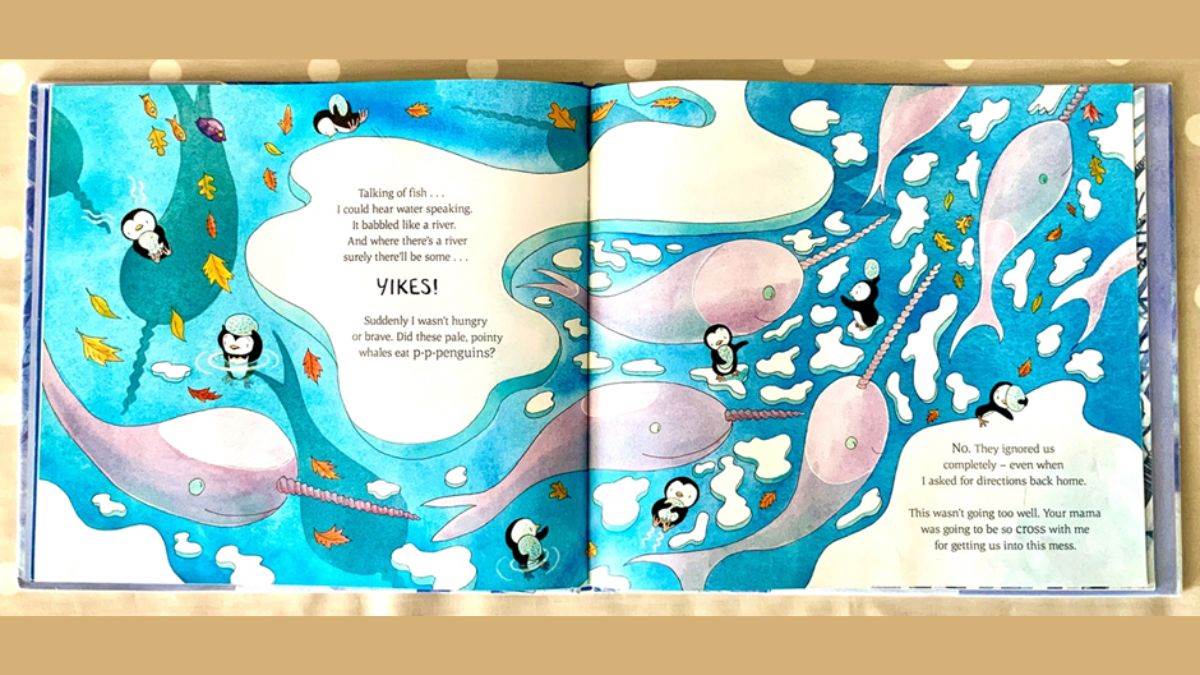
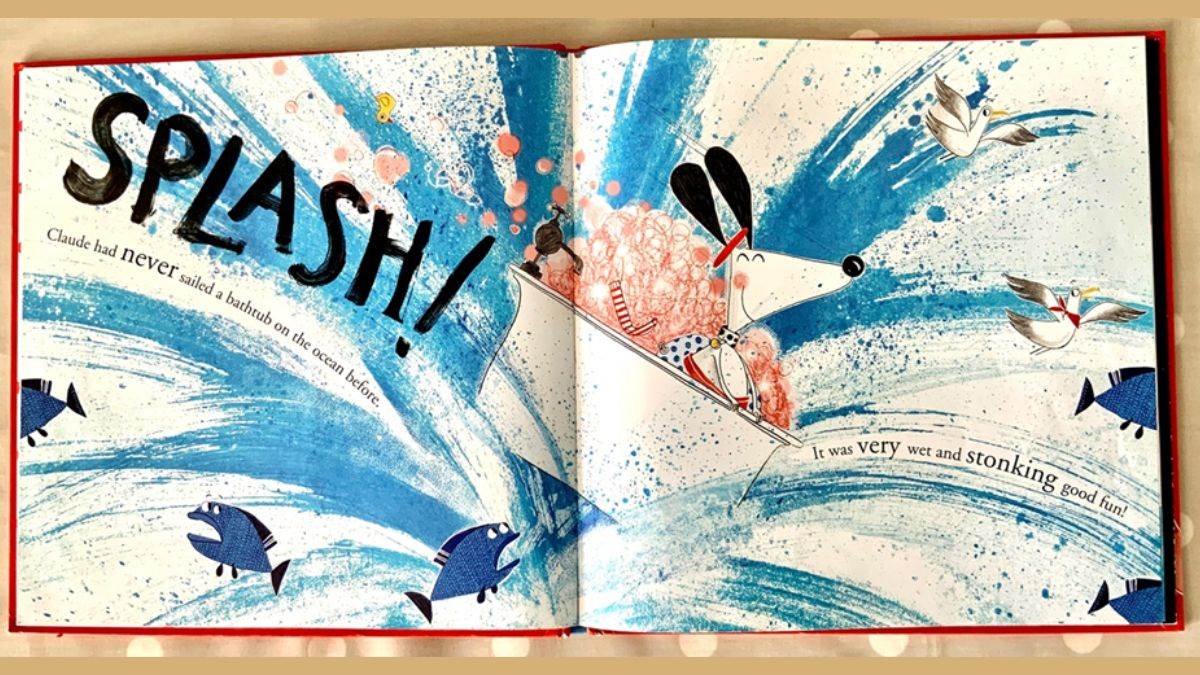
One of the many things all illustrators have to think about is how to make the written story and the pictures combine together successfully (the design team at the publisher will work with the illustrator on this). The easiest solution would be simply to place the text on one page and the illustration on the other, but if you prefer a spread (which is what you call the left and right pages together) to have illustration on both sides, you need to find other ways to juxtapose the wording and the images, and that's what the illustrators have done in all the books I picked. They’ve come up with some clever ways to fit the text into their pictures.
Here the words have been positioned in the open stable doors.
Here the ice floes make great spaces for the text.
And here the written words have even become part of the drawing, adding extra energy to the very splashy scene.
I once heard another illustrator say that creating a picture book is like directing a film, and it’s true that just as a film director thinks about what kind of shot and camera angle will work best for each scene, an illustrator will make lots of decisions about how best to present the illustration on each page. To produce a book that’s as visually entertaining as possible, we’ll very often try to vary the ways we organise the pictures as we work through the spreads. Here are some things that the illustrators of these books have done.
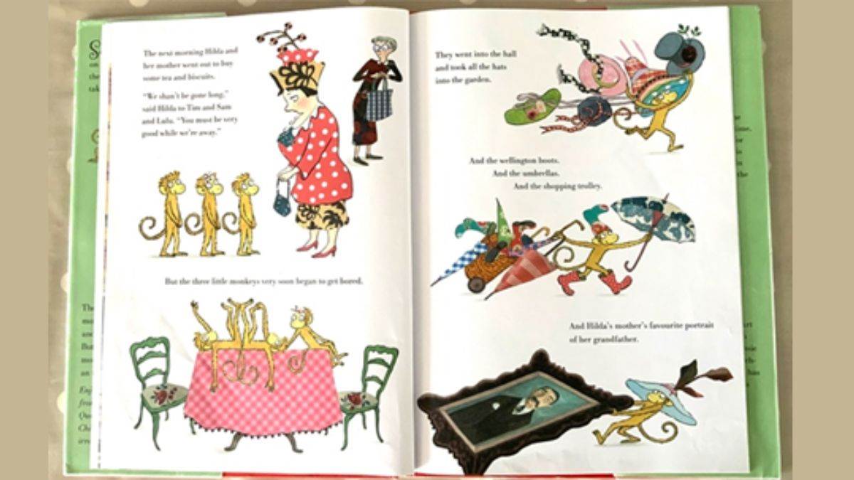
To help vary the pace of this book, when there are lots of things happening in the story the busyness is echoed on the spread with the text having been broken up and interspersed with lots of little illustrations. (These kind of illustrations without backgrounds are called vignettes.)
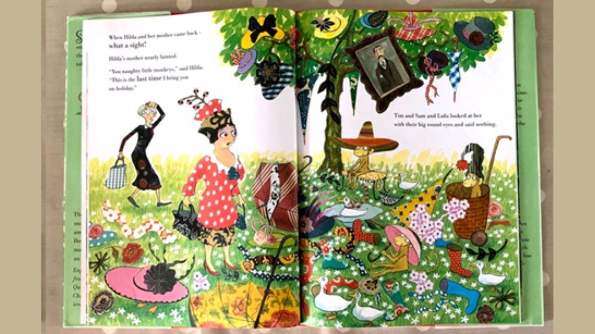
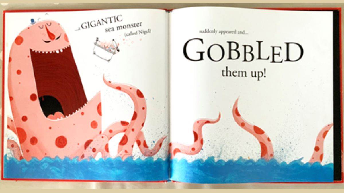
And on spreads where there’s one big, dramatic incident, there’s just one big, dramatic picture.
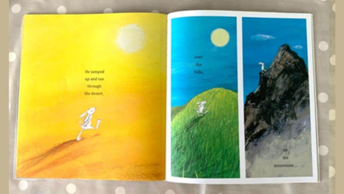
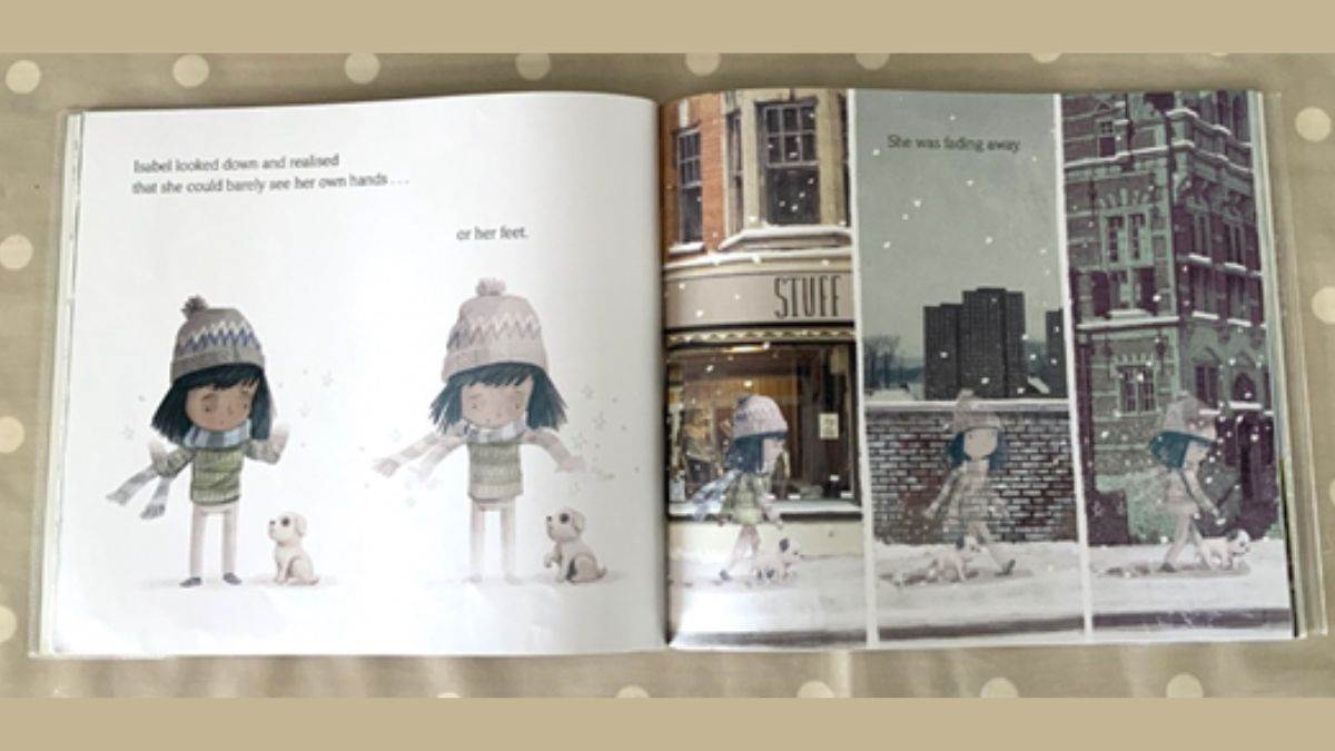
In these two books, the illustrators have emphasised the passing of time by dividing the spreads into strips, which actually has the effect of making you pause a little bit as you take in the row of images one by one.
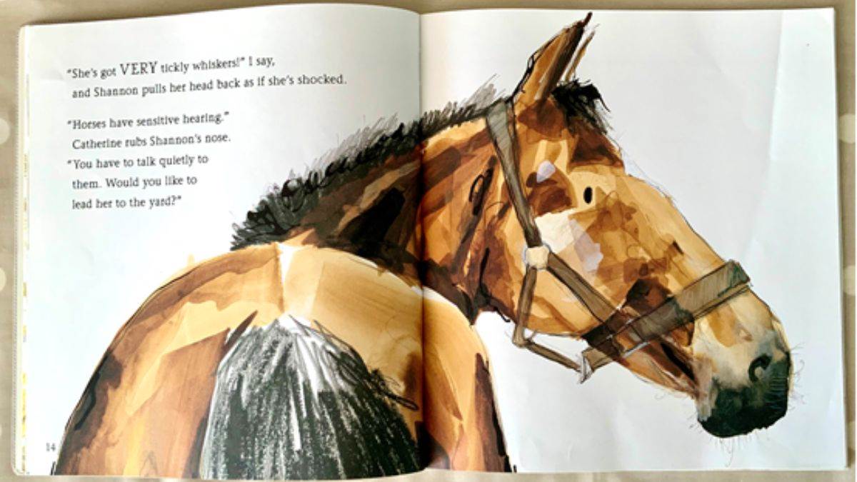
Drawing a character or object in close-up, or so large that it can’t be contained within the spread, will give it real impact.

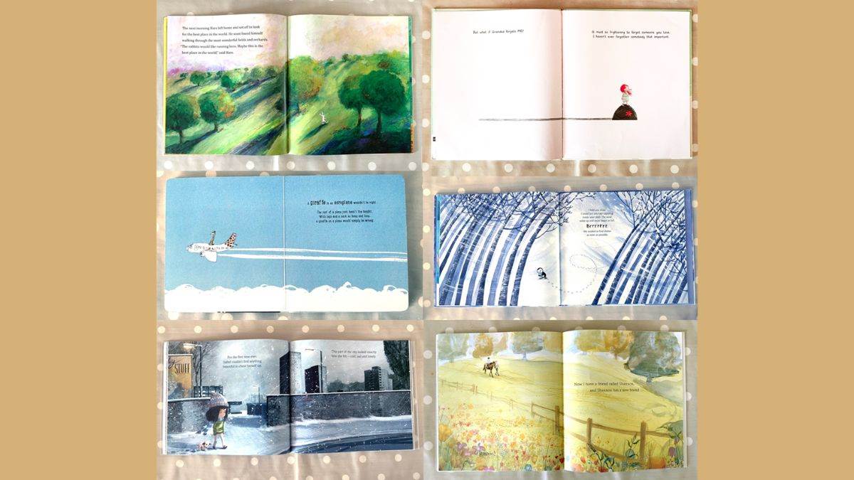
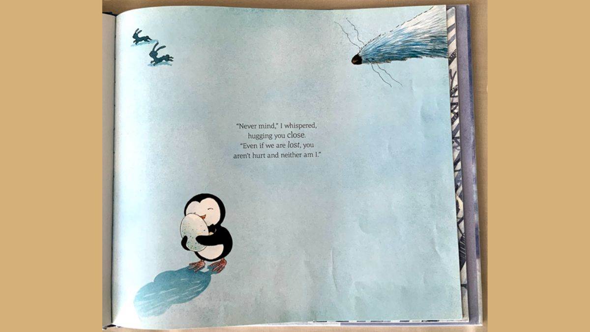
And it can be equally powerful to draw something very small, surrounded by a lot of space or background (which is also an effective way to make a character seem a bit vulnerable or lost).
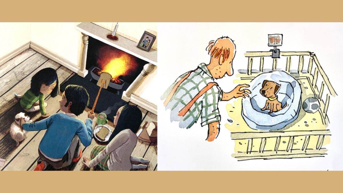
A scene viewed from an alternative angle to straight on – from above or below perhaps – is always interesting, and the different perspective often creates a sense of drama.
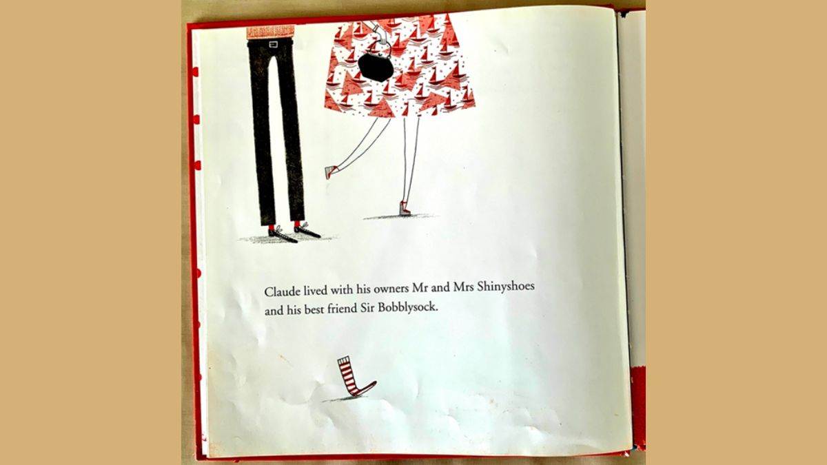
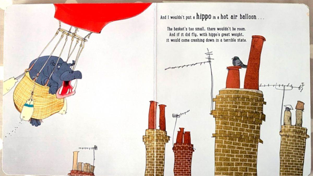
Sometimes it’s what’s left out of an illustration that adds to the fun.
Here you get to use your imagination to decide for yourself how Claude’s owners will look (with a clue or two from the illustrator).
Here you can conjure up in your own mind the sort of houses that go with those chimneys.
And who do you think that pointy nose might belong to?
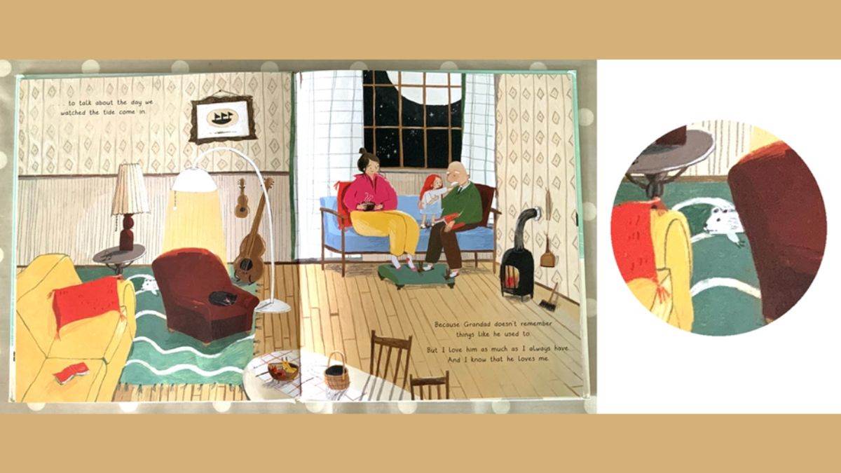
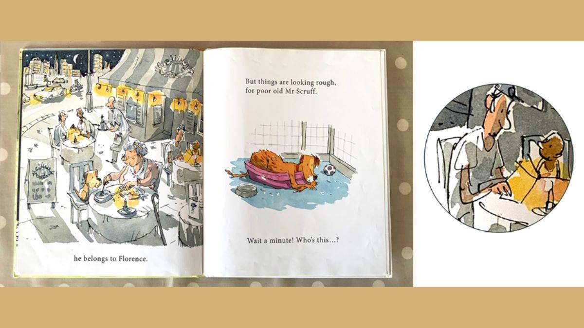
An illustration that completely fills a page or a spread can also give the illustrator great opportunities to fill it with clues to all sorts of stories that aren’t mentioned in the words, but are there for you to invent for yourself.
Who’s that behind the armchair?
What’s the little boy going to order?
Why’s that lady got her hair in curlers?
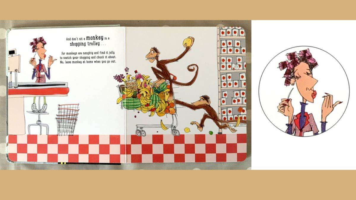
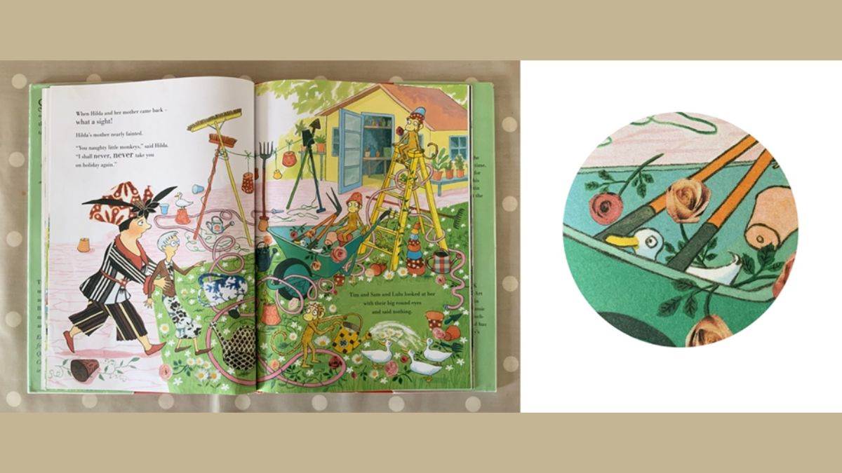
One of the biggest delights about picture books is when you discover a complete second story that’s only there in the illustrations. I’ve looked at these books lots of times now, coming across new things in the pictures each time, and it took me quite a few goes to spot the tiny bath duck having its own adventure in Claude All at Sea and to notice all the real ducks enjoying the goings-on in Three Little Monkeys. I’m sure young readers would be a lot sharper-eyed!

Books:
You Can’t Take an Elephant on a Bus, Written by Patricia Cleveland-Peck, illustrated by David Tazzyman, Bloomsbury Children’s Books
Claude All at Sea, Written by Alex T. Smith, Hodder Children’s Books
All the Way Home, Written by Debi Gliori, Bloomsbury
Mr Scruff, Written by Simon James, Walker Books
The Tide, Written by Clare Helen Walsh, illustrated by Ashling Lindsay, Little Tiger
The Best Place in the World, Written by Petr Horáček, Walker Books
Hello Horse, Written by Vivian French, illustrated by Catherine Rayner, Walker Books
The Invisible, Written by Tom Percival, Simon and Schuster
Three Little Monkeys, Written by Quentin Blake, illustrated by Emma Chichester Clark, Harper Collins
Topics: Picture book, Writer in Residence, Features, Nick Sharratt

