Sarah McIntyre on illustrating The Prince of Pants
Published on: 09 June 2017 Author: Sarah McIntyre
The immensely talented and down right wonderful illustrator Sarah McIntyre, who's work includes Vern and Lettuce and The Legend of Kevin, became our fifteenth Writer in Residence back in 2017. In this blog Sarah asks have you ever wanted to illustrate a picture book?
Have you ever wanted to illustrate a picture book? Or are you a writer, and wonder what's behind the magic of those pictures that appear with your words? Let me give you an insight into the process I used to make The Prince of Pants come alive.
Here's what a picture book looks like before it has any pictures!
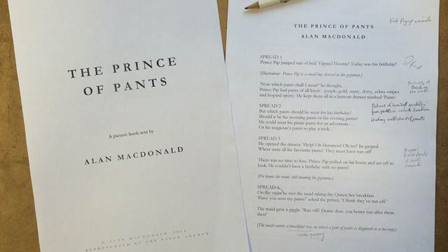
You can see I'd already been scribbling picture ideas in the margins of Alan MacDonald's text. I hadn't even met Alan at this stage, and I was thinking I was going to write my own picture book. But I'd put so much effort into the book right before it, that when Pauliina, my editor at Scholastic said, 'OK, where's your text?', I replied, 'Uh... Could you give me a month to get back to you?'
She agreed, but asked in the meantime if I'd look over this story and see what I thought. And I thought, "NO, I want to write it myself!" But I sat in a pub and had a look through it, and giggled. And then started to think of all the fun stuff Alan's words would inspire me to draw, things that weren't even mentioned in the text, but that could make it even funnier. And I realised I really, really wanted to illustrate this book.
I also thought about Alan's other work: he has a great history of writing the Dirty Bertie books for brilliant illustrator David Roberts, who came up with the original Dirty Bertie concept. (I love David AND the Dirty Bertie books.) And I asked David about Alan, and he said Alan was lovely to work with. (Of course David would say that, David says that about everyone. But still.) So I came back to Pauliina with an enthusiastic 'YES!'.
Drawing the characters
The first thing I did was try to figure out how the characters would look.
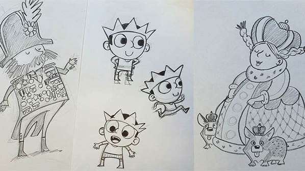
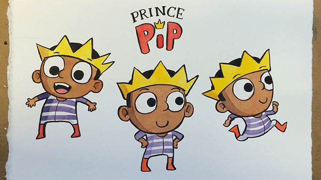
I wanted the king and queen to be quite flamboyant. Prince Pip does a lot of racing around the book while he looks for his missing pants, so I wanted him to be tiny, like a bumblebee, so he could flit about fast.
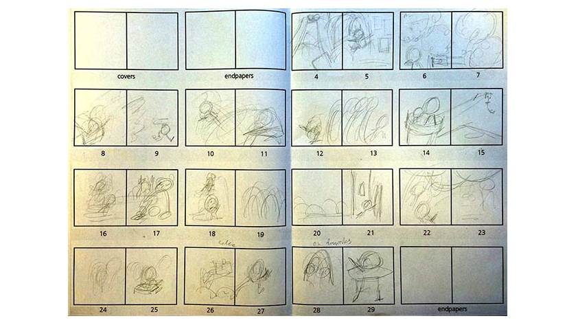
The next stage of the book is called "thumbnail roughs". This is because they're rough drafts that are so small that they're almost the size of your thumbnails. They're basically a way of simply figuring out what can go on each page, and get an idea of the pages' general composition.
Putting together a picture book
Here's a handy tip: if you're writing a picture book, it pays to have a blank version of this grid sitting right in front of you. Because of the way the huge sheets of paper are cut, this 32-page format is the most cost-efficient way of producing a picture book with the least waste of paper. So if you're pitching a book to a publisher and it fits in this format, they'll be far more likely to take your submission seriously, and see that you have some knowledge of how books work.
I find having this template helpful. It shows me exactly the amount of space I need to fill, and I'll write a book right into the boxes. (You can find a blank version here on my own blog.)
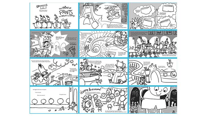
After I've done a very rough version that I can barely make out in pencil, I tend to make scrappy digital drawings in Adobe Photoshop with my Wacom pen so my editor and designer, Strawberrie, can get an idea of what I'm trying to show. You might actually recognise a lot of these pages now from what you can see in the final book. I like doing this stage digitally because I can move around the text and cut and paste things about fairly easily. I don't actually like the look of the line I get with a Wacom pen, but it doesn't matter at this stage.
Painting the details
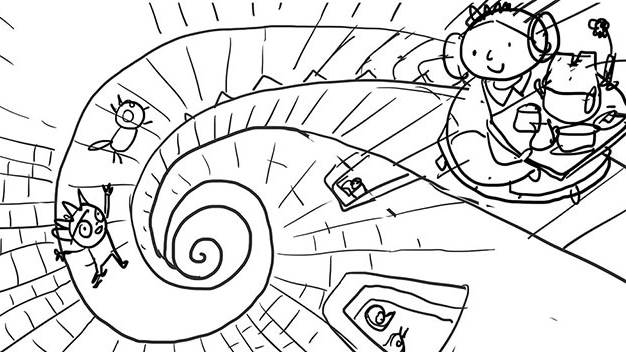
Here's a close-up of a thumbnail rough of two of the pages. (Two pages that you look at together are called a 'double-page spread'.) With a double-page spread, you can decide to draw a picture or several pictures on each page or have one picture that stretches across the whole spread, as this one does.
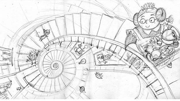
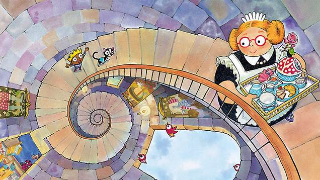
I tried to think of the most interesting way to draw this staircase and I thought it would look great if I made it spiral around dramatically. I also thought about the perspective: it's like we're sitting in the top of the tower, looking down. This way you get a clear view of the spotty pants being used as a tea cosy, but Prince Pip's further away, so he won't be able to spot them as easily. It's fun when the reader can see things that the main character doesn't know about. (One of the visual gags of the book is that Prince Pip's pants keep showing up everywhere but they're just out of his view.)
For this version, the "pencil rough", I drew it slightly larger than full-size, with pencil on paper. It's actually 110% of the final size that you see in the book. That way, if the designer needs to enlarge or shift things around slightly, she'll have a bit of extra room. And it gives me a tiny bit more room to paint details.
And here's the final painted version! This one took ages; I wanted each stone in the wall to be a slightly different colour to make the overall appearance more luminous. You can see right into Prince Pip's bedroom through a door (where Prince Pip was on the last page), and some pseudo-medieval tapestries. I think the little animals are very important. When I read this book with babies, sometimes they're too young to be interested in the words, but I can go through the whole book pointing to the animals and making the animals sounds, and they love that.
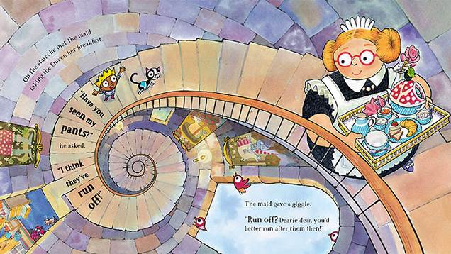
And here's the final stage, before the book goes to the printers, where the designer adds the text (using Adobe InDesign, I think.) She knows more about typography than I do, so she picks the font she thinks will work best. And she tries to make the text move in fun ways that complement the action of the story, but most importantly keep the words very easy to read. And we always have to leave a bit of extra room "for the Germans", because if the book is translated into German, their text is always a little bit longer than English.
Getting the colours just right
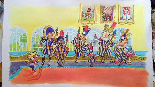
Here's a photo of a finished double-page spread on my desk! For these books, I use black India ink with a dip pen to draw the lines, and a brush and coloured inks (which work like watercolours) to paint everything else. (I like India ink because once it's dry, it doesn't smear if I paint over it.) Sometimes I use a little bit of coloured pencils, too. I paint a bit extra around all the edges, in case we need to shift the picture around on the page slightly. Or in case the printer doesn't cut the pages exactly right, there won't be tell-tale white bits around the edges. (This extra margin of artwork is called the 'bleed', because it 'bleeds' out from the main artwork.)
Then there's quite a long wait while the book goes to the printer and they make sample pages so the designer and I can test that the colours look just right. For The Prince of Pants, Strawberrie suggested we try printing the books in FLOURESCENT inks. Whoa!
Usually when my paintings are reproduced in books, they look a little bit less vibrant than the original artwork. But when this book came back from the printer, I opened the pages... and started laughing. The colours were SO BRIGHT!!! WAY brighter than my original paintings! I had never seen a book so bright. Like, they actually light up the face of whoever's reading it, they're that bright. And since it's a comedy book, I absolutely loved it. The printer had to use special inks to create the glow-in-the-dark pants at the end. (That would have cost Scholastic quite a lot more, but it's essential to the story, so luckily they went for it.)
Launching The Prince of Pants
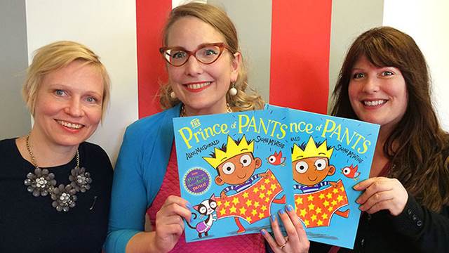
Here's the team who made the pictures happen! That's our editor Pauliina Malinen on the left. She's originally from Finland. English isn't even her native language but she's brilliant at her job, and she has a great sense of humour. And that's Strawberrie Donnelly on the right, who's our designer, and who works with me on everything to do with visual layouts. Pauliina and Strawberrie make a great team.
Publishing takes aaaaages... You think a publisher could sell the book as soon as it comes back from the printer, but there are so many business things they have to do before then. That includes trying to sell the rights to foreign publishers to print it in different languages. So it can take a whole year before we actually get to have a big party and launch the book. Usually I get ready by making some book-related activity pages for my website.
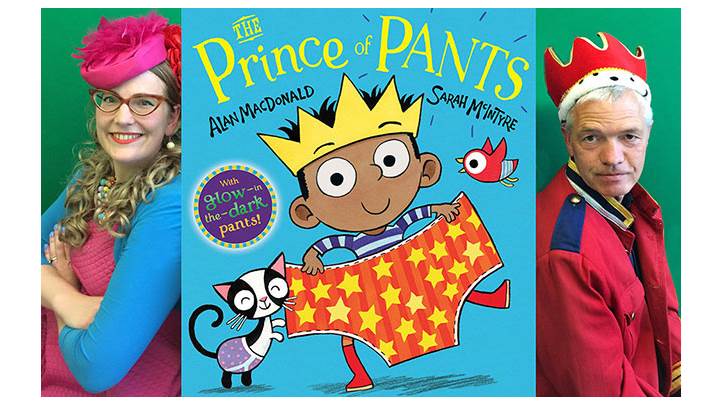
Finally, the launch date for The Prince of Pants rolled around and I got to see the rest of the book team and meet Alan. He's a lovely chap, just as David said he'd be. Alan lives in Nottingham and I live in London and and we've gotten together to do some events, and done some solo events, to let people know about our book - including drawing, a ukulele song and a Pants race!
What do you think?
Now the only thing missing in this is YOU... I hope you get a chance to see this book we've been making! Let me know if you like it. It's always great to hear nice comments and see people's book-inspired drawings.
Topics: Funny, Picture book, Writer in Residence, Features


